
The quality of an eCommerce store’s design is no less important than the products that are sold in it. Without a doubt, the use of best-practice UX/UI solutions can boost conversion rates. It can keep visitors from abandoning their shopping carts and the website. Plus it has an impact on overall customer satisfaction. This is why we’ll introduce you to those website elements that positively influence sales in the online retail sphere.
10 “Must-Have” Design Elements on eCommerce Stores
Unquestionably, the ease of navigation and a quick mobile-device optimized website should rank high among an eCommerce website’s priorities. Thus, let’s get acquainted with those parts of an online retail store that deserve special attention. This regards those design and UX/UI solutions that are aimed at growing sales.
1. Neat Top Menu
The first site element that needs to be taken care of is the website menu. Excessive and too complex menus are confusing and difficult to navigate. Therefore, they should be as minimalistic and simple as possible. In much, this also depends on how well the products are categorized. So, ideally, keep in mind the product categories and their hierarchy when deciding on what goes on the menu.
Spacing is another thing to note as many site users can be browsing the store from their mobile devices. Thus, every clickable element should be easy to tap on. Likewise, a smart search bar deserves a spot in the header area too.
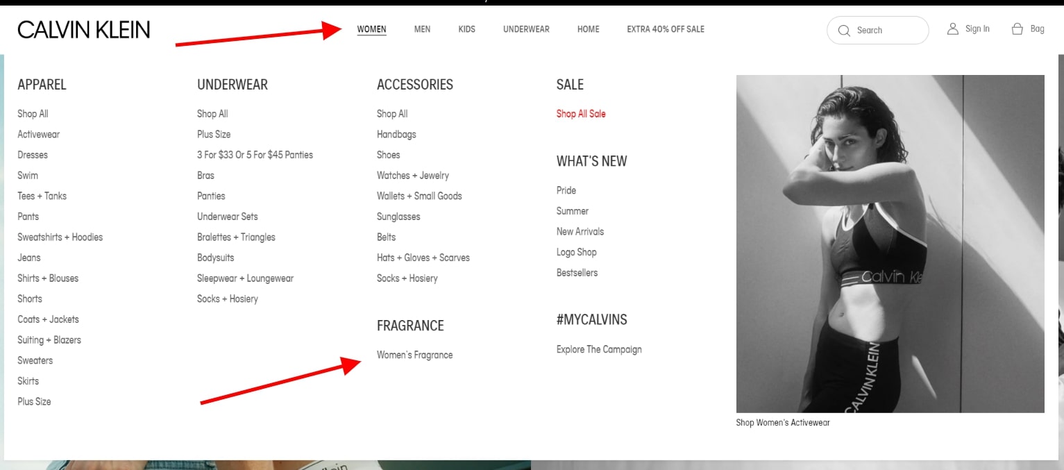
Below is a screenshot of the top menu of the official Calvin Klein website. As you can see, any product page is placed in as little as several clicks from the first menu level. Plus, each link is adequately distanced from one another, making it easy to navigate the site.
2. Minimalist Category Pages
Moving on to the categories, it must be noted that overcrowding such branch pages is a very bad idea. The products presented in the grid listing must each have the right balance of needed information and enough image space.
At this stage, visuals are more important than the product details are. This is why many eCommerce stores choose to show a second image of the product when it’s hovered over. Furthermore, space-saving is key, therefore, discounts and product ratings are often placed as labels atop the images.
On another note, filters must also be given enough thought. The main aim of their use is to simplify the search process. So, showing only the needed filters, presented in the most optimal selection variant is the right way to go. This can be a checkbox, picklist, or other options.
Not to mention the role of “breadcrumbs” that show the path of the pages. They give guidance to users regarding where they are on the website. Moreover, they orientate site crawlers (which is needed for SEO). Again, here’s another reason why the page hierarchy and categories must be taken seriously.
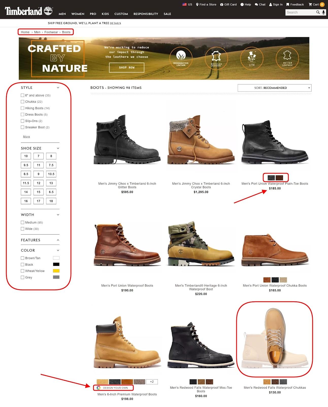
For a vivid example, take a look at the category page on the official Timberland website. Here we can see the breadcrumbs stripe. There’s a great filter section with multiple selection options including checkboxes and buttons. The grid of products is rich each with large pictures that change when being hovered on. Plus, there are only the minimum product details, including the price and color variations.
3. Wishlists & Gift Functionality
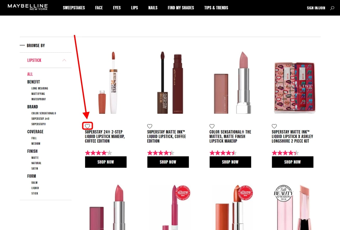
Not every website user is ready to buy right away. So, giving the opportunity to save an item for later is an outstanding way to engage customers. It can also encourage them to sign up. Marketers can also leverage such “saved item” data, say, in email campaigns, which adds additional importance to the element. This is how an “Add to wishlist” looks like on the official Maybelline website.
Topping that, giving gifts is often a thorny issue for people. Therefore, providing solutions for easily finding ideal presents for their loved ones and friends is a fruitful idea. Various gift finder sections and step-by-step choices narrowing down the search is one idea. Even “Send a gift hint” buttons that handle the gift-receiving part are neat eCommerce store elements worth considering.
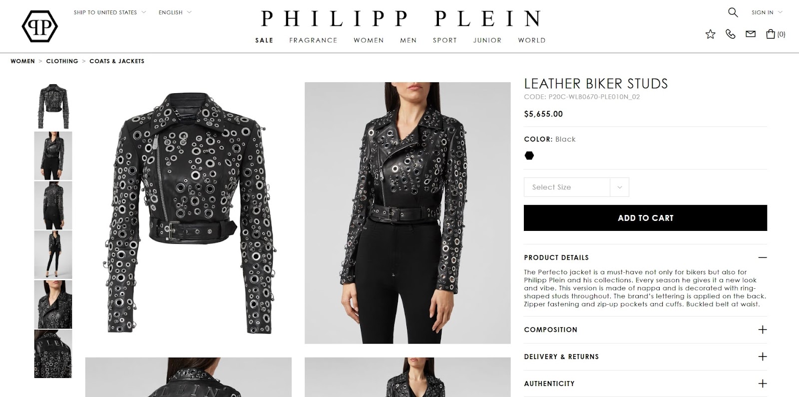
4. Top-Notch Galleries
As shortly aforementioned, images play a crucial role in product presentation. In most cases, people tend to care more about how an item looks visually than how it is described. For this reason, the pictures that are used on the eCommerce website have to be of impeccable quality. At the same time, they must be compressed to their minimal size to not slow down the page loading time. Often this is reached by using the WebP image format.
Various famous brands select in favor of different gallery layouts for their product pages. The type of gallery layout like the one used on the official Philipp Plein website is currently quite popular. As a rule, the pictures occupy a large area of the product page. The item can be zoomed to be seen up close. At times, even video or 360-degree product rotations are implemented too.
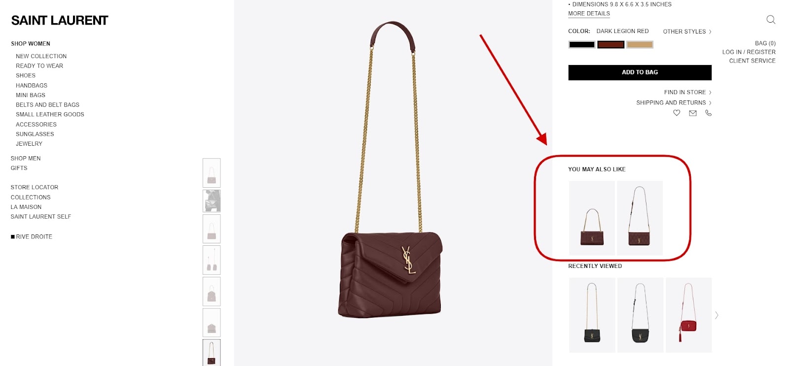
5. Personalization Features
Every shopping experience has to be as personal as it can get. Not treating every client like a unique individual that deserves separate attention can ruin the shopping experience of many users. This is the reason why adding elements that can help to make the website visit more personal is vital.
Here’s how such a “You may also like” block looks like on the official Saint Laurent website. The element pulls similar items that the person may consider buying. The more advanced functionality of such can even make product selections based on the user’s search history or earlier buys.
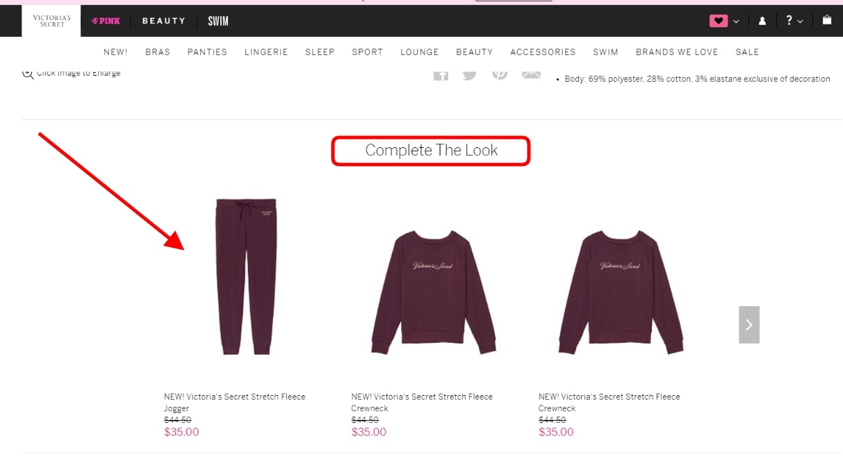
6. Upselling & Cross-Selling
Don’t overestimate the power of product suggestions. Serving as a silent personal shopping assistant, sections that pitch products that go well together can be helpful for clients. They can also increase the store’s average order size!
For instance, this is how the official Victoria’s Secret website upsells products. The “Complete The Look” section is fitted with items that can be a good match to the currently browsed product.
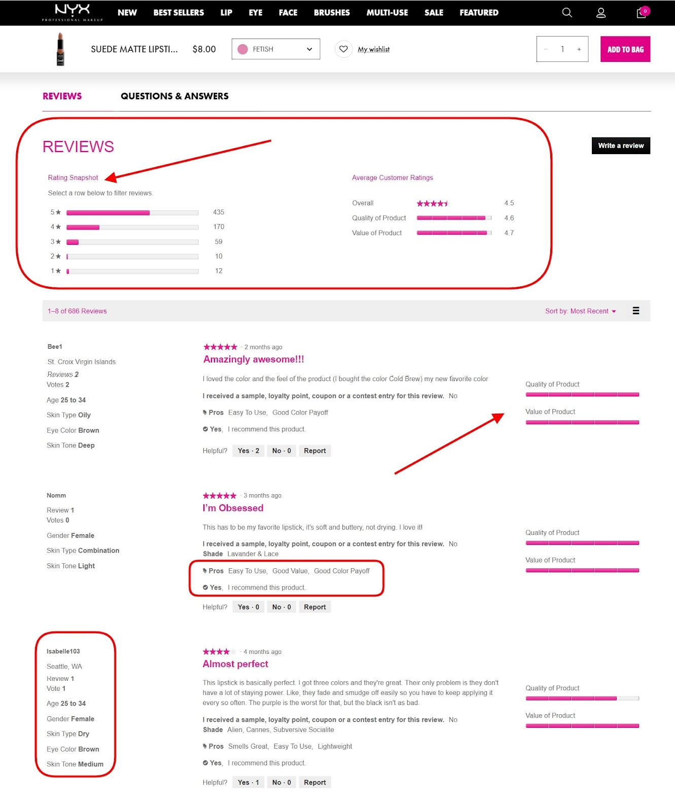
7. Rich Feedback Blocks
Client reviews are an unmissable element for eCommerce sites as testimonials are indispensable for influencing purchasing decisions. That’s why product ratings and opinions regarding an item’s strengths and weaknesses often take up large areas of product pages. Apart from indicating a rating and inputting comment texts, it makes sense to allow reviewers to upload their own images. Fields that verify that the user is a real buyer also help. These include their name, location, age, or even worn size, to name a few.
This is a screenshot of a reviews section on the product page on the official NYX Cosmetics website. Before showing the latest reviews, their general overview is placed in the “Rating Snapshot” that summarizes all the feedback. We can also see the reviewer’s information to the left of the comment. To help make the review-leaving process faster, the “Write a review” form contains not only a text field. It also points such as “I recommend this item: Yes/No”.
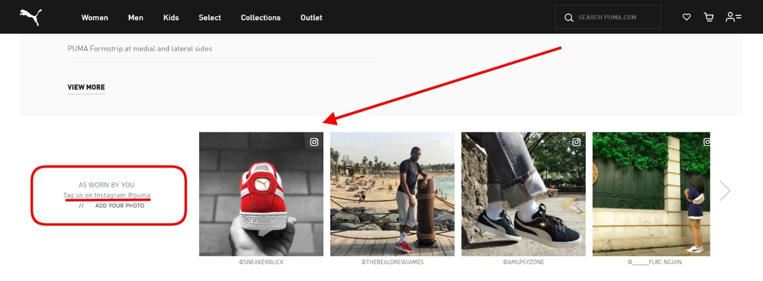
8. Social Proof Presence
Undoubtedly, you should save a special spot for featuring social media on an eCommerce store. Connecting socials can be beneficial for growing the company’s official social media accounts. Likewise, it’s great for engaging users who are browsing the store. That said, widgets that withdraw user-generated posts can bring a favorable effect. Such content can inspire others to buy something. It also presents great social proof of how other real people are enjoying what they’ve bought.
Take a look at the “As Worn By You” section on the official Puma website. Notice the wonderful tactic that Puma uses for stirring up the interest of clients to participate in the brand’s socials. They request to tag their official Instagram account in posts to get featured on the website.
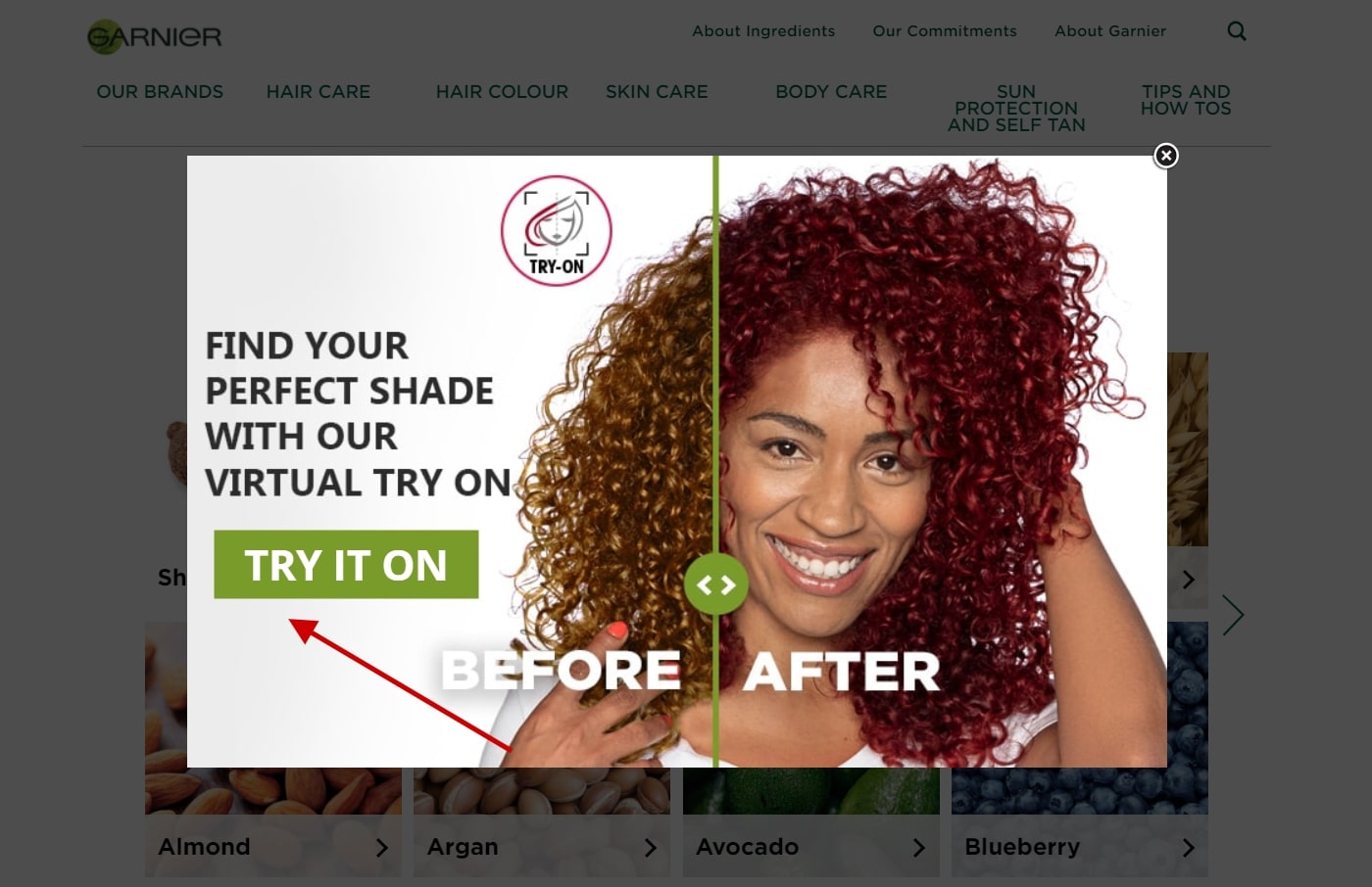
9. Implementing New Technology
Giving modern technology a shot can also be a suitable thing in the sphere of eCommerce. Virtual try-on can be a great element that’ll encourage users to buy a product. Especially if the store specializes in beauty products, makeup, or accessories. Fair enough, such augmented reality perks also work for clothing and furniture, to name a couple of more branches.
Using a mobile device’s camera or a photo upload, the technology allows you to see an item in real-time. It shows how this or that product or item will look like on a person (or in a location). This is handy for clearing up all doubts about whether a product will suit a person or not. This often happens with shades of cosmetics, for example.
Here’s the official Garnier website as an illustrative example. It offers to try on a color of hair to see what the hair dye can look like. Since hair dyes are always a touchy subject, such a solution can be wonderful for removing guesswork and doubts.
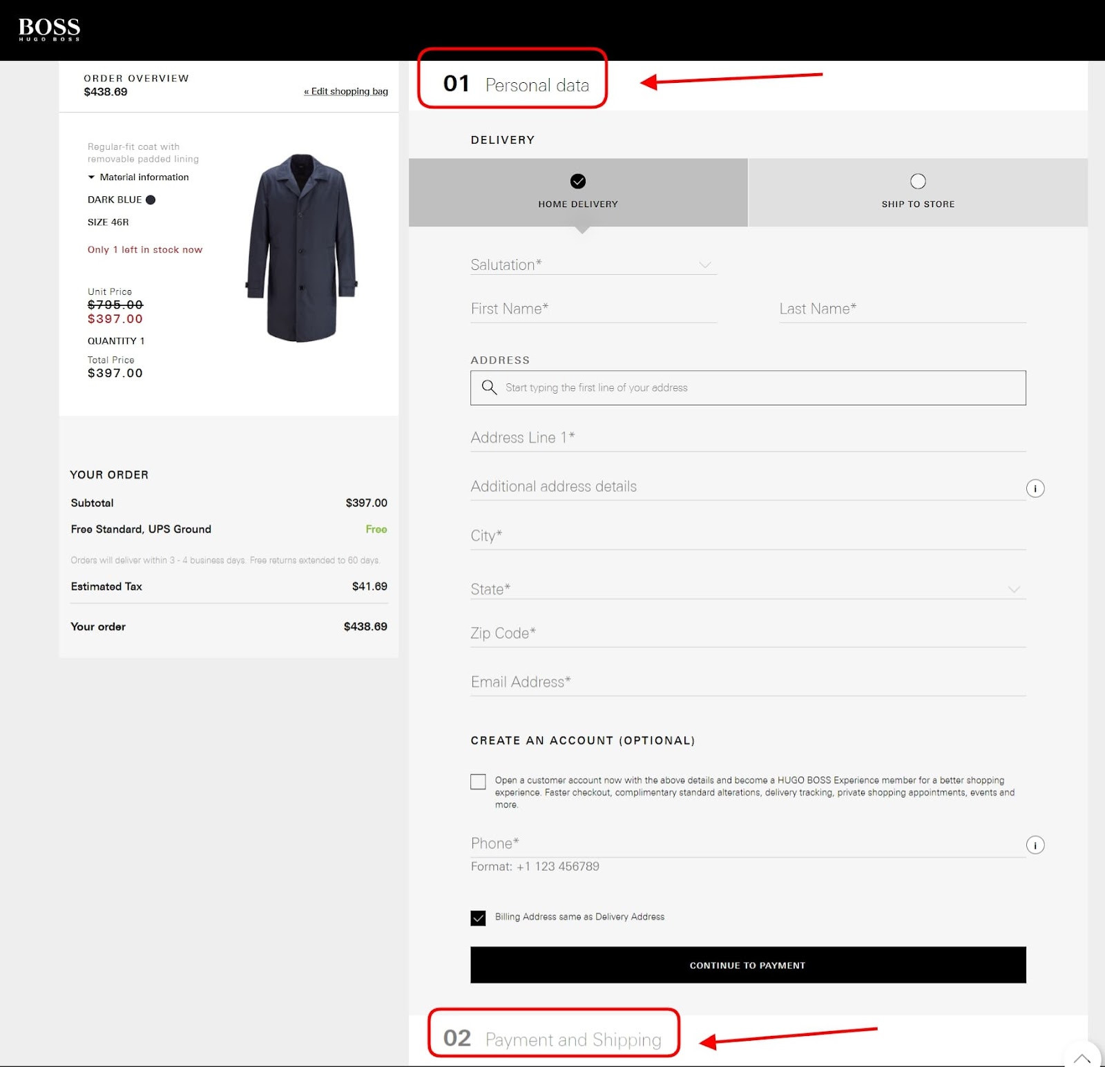
10. Keep the Checkout Simple
Finally, the tenth point among the eCommerce elements to not miss out on deals with the product checkout. Saving the customer’s time and making it easy to buy a product are the foremost points to bear in mind.
Therefore, the best thing that could be done is minimizing the checkout and removing all the unnecessary elements. By leaving just the required fields and showing the overview of the order, it’s likelier the client will buy. A great example of this is the checkout on the official Hugo Boss website that’s shown below.
Final Say
To sum up everything above, proper design decisions can greatly influence the success of an eCommerce store. After all, it’s a huge pity when users leave the site without making a purchase. Particularly if it’s because of slow site performance, bugs, or overall unsatisfactory shopping experience. The elements that were covered in this post can greatly improve the sales and conversions of online retail stores. Therefore, consider adding them to your own store too!